

Introduction
Part 2 of the previous article ‘Perspectives on architecture photography’ where I discussed the place of negative space and the maximum amount of perspective in architectural photography. My premise in that article was that in ‘true’ architectural photography the design of the architect plays an outsized role while negative space is the opposite of the dynamics, visual energy and tension I want to convey with my architectural photographs. A dynamics and tension I’m trying to amplify with the use of the Maximum Amount of Perspective. Hence negative space has no function in my architectural photography and is at best inevitable.
In this article I will be highlighting a few artists I draw from for inspiration for compositions in architectural photography. Artists that have had a substantial influence on me when it is about how architectural images can be presented effectively and aesthetically in a frame. Artists who have made their mark in visual arts centuries ago, long before photography.
Piranesi and 2-Point perspectives and vertical framing
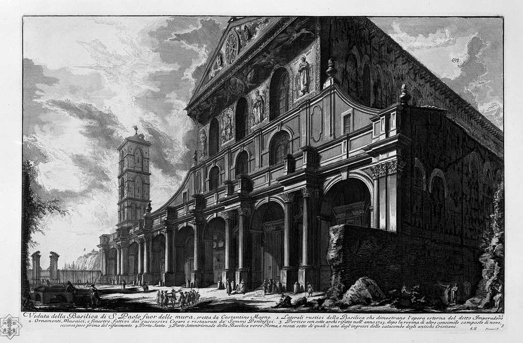
The first one is Italian draftsman and engraver Giovanni Piranesi (1720-1778) famous for his etchings of Rome. Piranesi developed a visual language for exterior architectural compositions where vertical framing elements play an important role to ‘frame’ images. Also, Piranesi often used 2-point perspectives and multi-facade compositions or ‘cut off’ parts of buildings or cropped images very tightly to increase dynamics and tension in his images. As a pure architectural draftsman and engraver, negative space was only an element that could not be avoided. Rarely something to be used intentionally.
Pieter Saenredam and asymmetrical architecture interiors
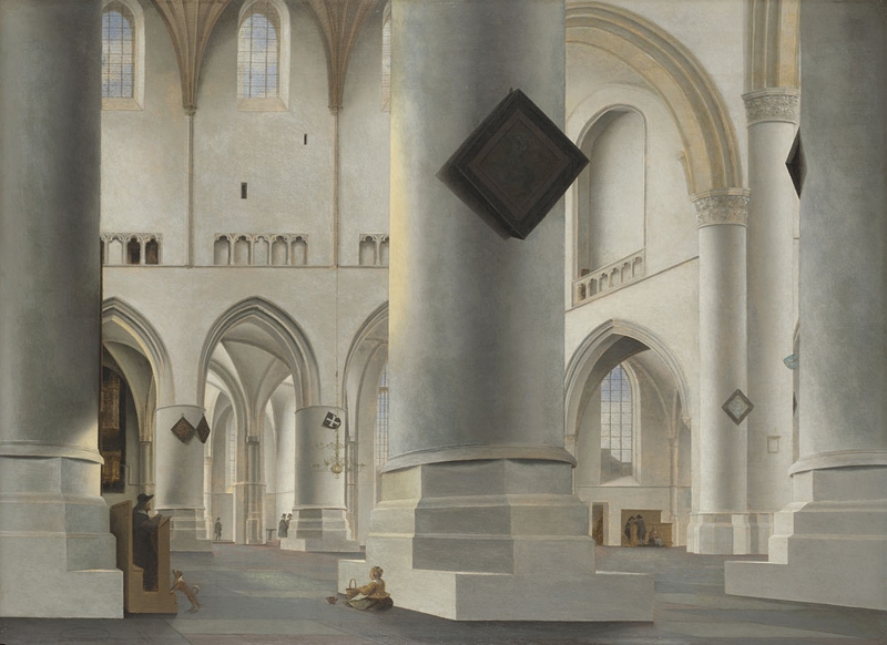
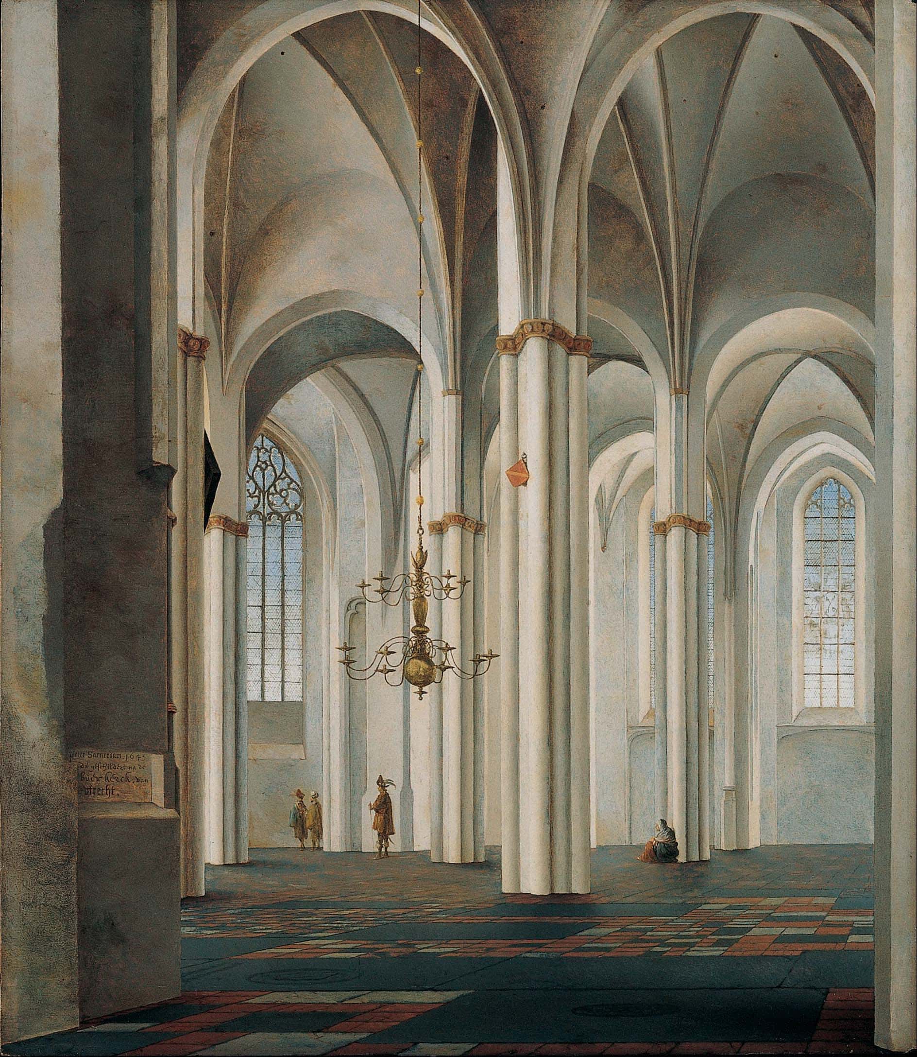
The second one is a Dutch painter, Pieter Saenredam (1597-1675), who mainly painted church interiors. One of his famous works are on display in the National Gallery in London, UK. He shows how to compose interiors of architecture in a way that is exciting, dynamic and never bores. Where contemporary photographers of interior architecture have the tendency to present interiors in a symmetrical way, myself included as it is an almost instinctive urge to ‘ground oneself’, Saenredam shows us, centuries before Greg Albert’s principle rule, laid out in his book ‘The simple secret to better painting’ that no 2 intervals should be the same to avoid static compositions that are boring.
Giovanni Battista Piranesi
Giovanni Battista Piranesi has become known for his etchings and drawings of Roman architecture. His compositions can be recognized for being:
- asymmetrical
- 2-point perspectives with multiple facades visible
- vertical framing elements like parts of trees, buildings or other objects along the sides of the frame to ‘frame’ the architectural objects
- architectural objects framed tightly around the top edges, or sometimes side edges of the frame, with no regard for negative spaces – they are not relevant to this genre – to create amplified and distorted perspectives
- sometimes cutting off tops of buildings to create more visual tension
It was said that through his dynamic and amplified compositions, by framing tightly, Piranesi has shaped the conception of Roman architecture so much that even Goethe was disappointed to see the buildings in real life.
On the left the Pantheon by Piranesi with two facades visible, asymmetrical and vertical framing elements. The top is touching the edge of the frame
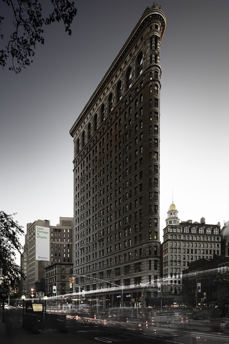
On the right, my image of the Flatiron building in New York with the vertical framing elements on the left, the top of the building touching the top edge of the frame and the two facades visible.
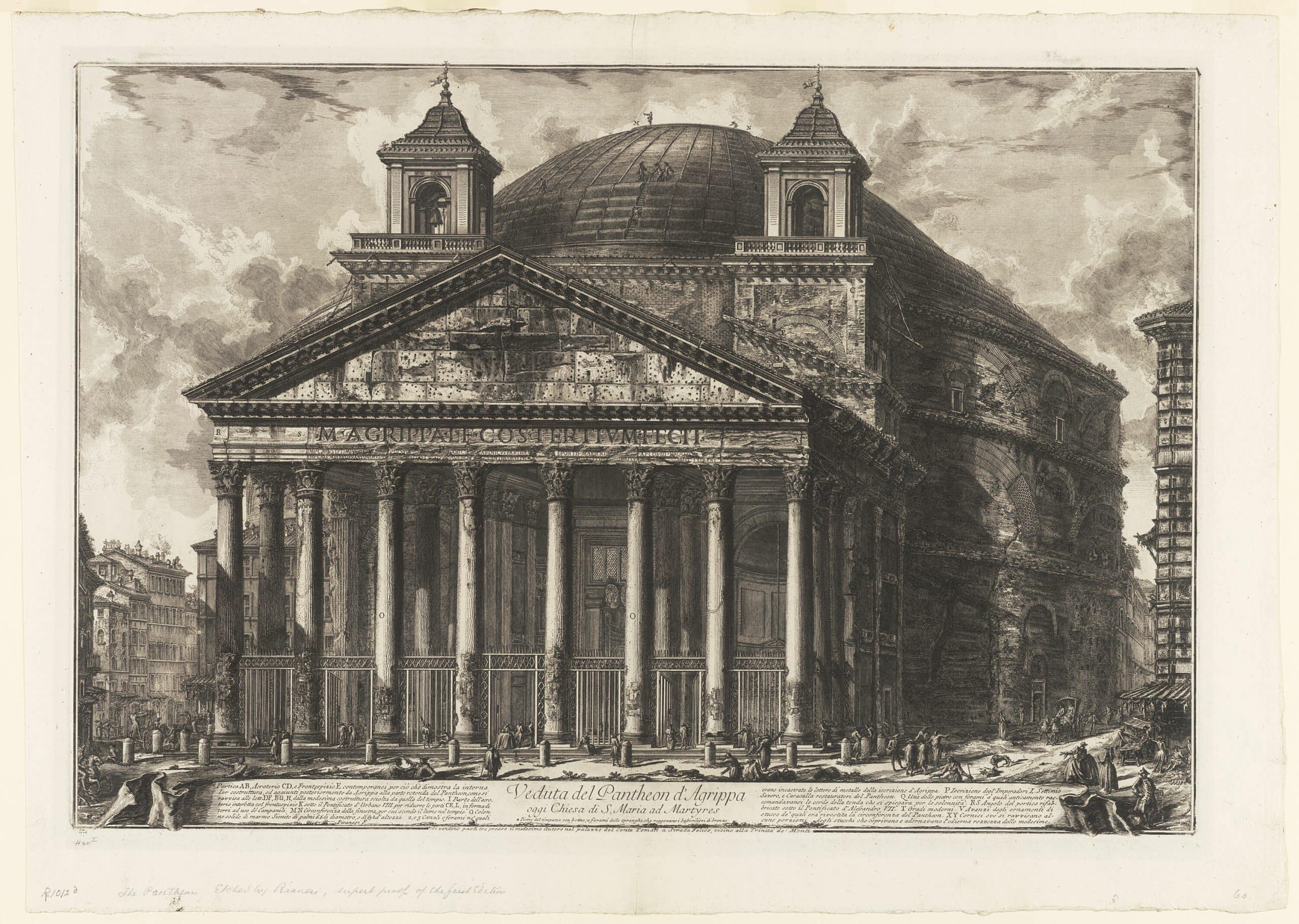
On the left, Piranesi’s image shows the amfitheater positioned tightly to the top edge with trees almost accidentally but still deliberately visible on the side edges to frame the image.
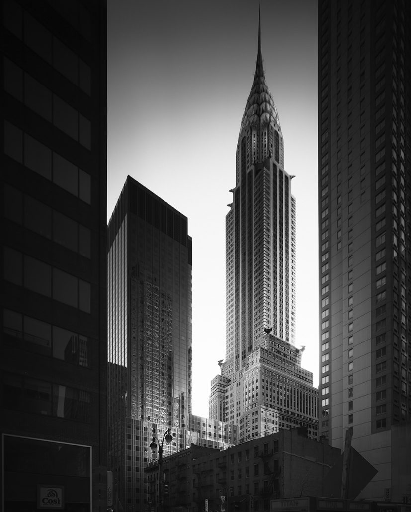
On the right, my image of the Chrysler building framed tightly to the top edge, using vertical framing elements.
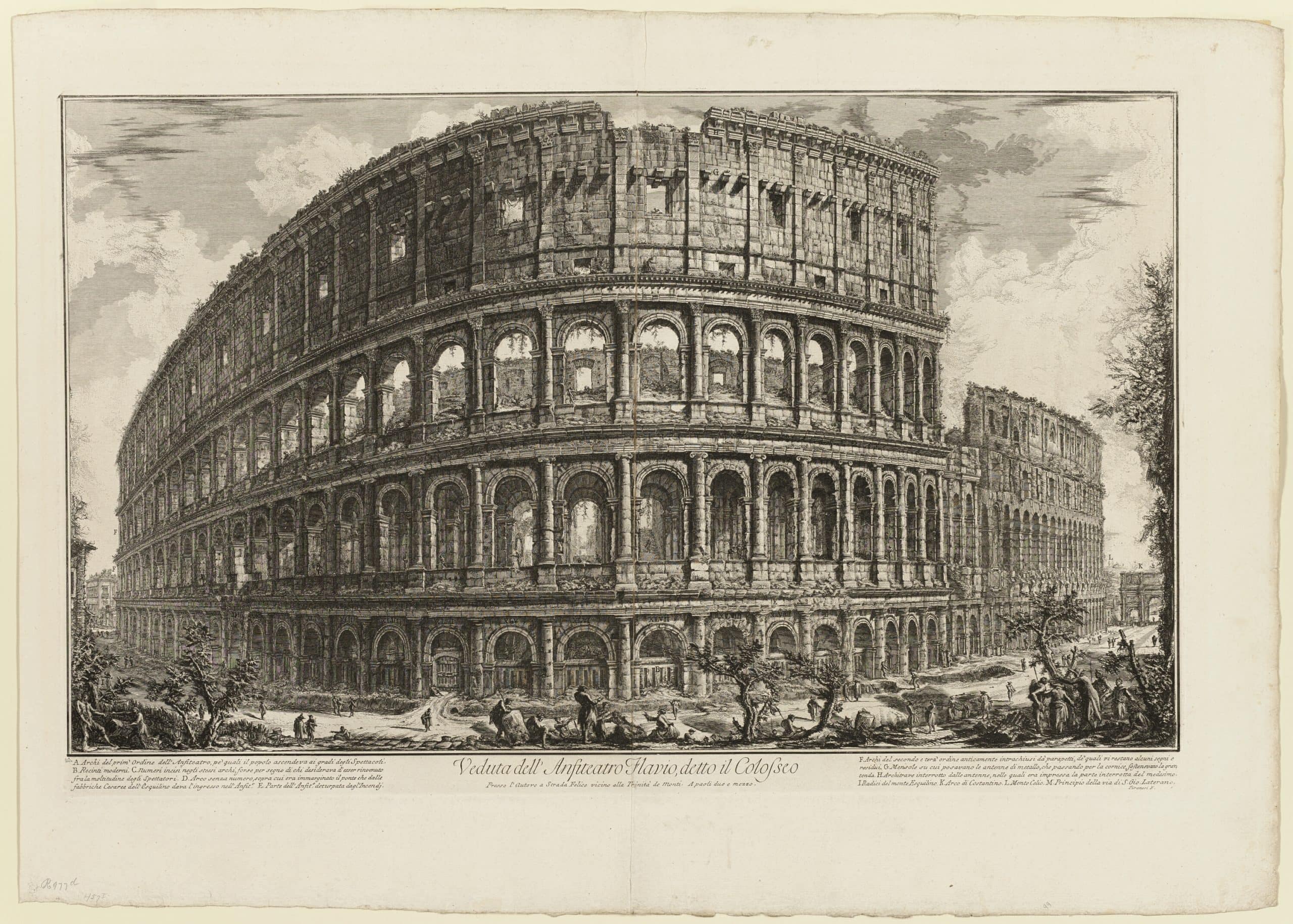
On the left, Piranesi cut off the top of the building, creating visual tension and energy with a 2-point perspective showing 2 facades of the building. Note again, the tree cut off by the left edge to frame the image.
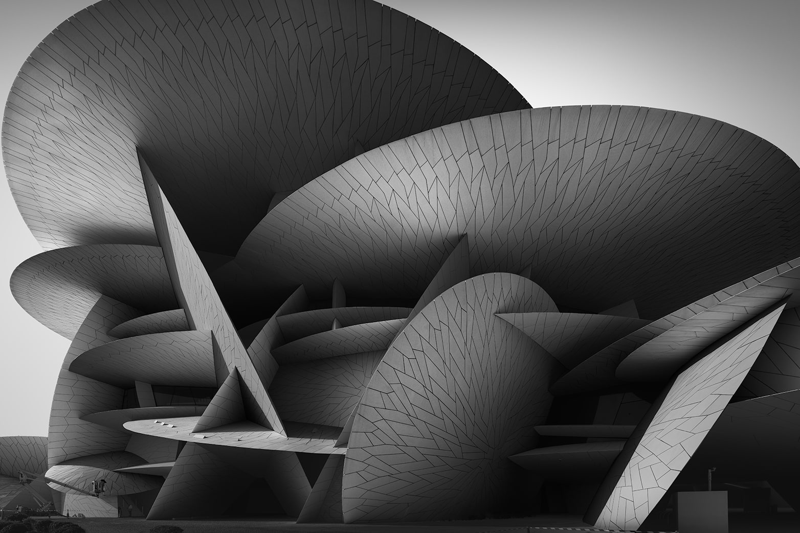
On the right, my image of the National Museum of Qatar, positioning the building very close to the left edge with the top of the building cut off.
Finally, on the left again, Piranesi cut off part of the top of the building, using a 2-point perspective showing 2 facades of the building. Again, the trees cut off on both edges of the frame to frame the image.
On the right, my image of the old palace at the National Museum of Qatar, with a similar angle and the left top part cut off in similar fashion as Piranesi’s image.
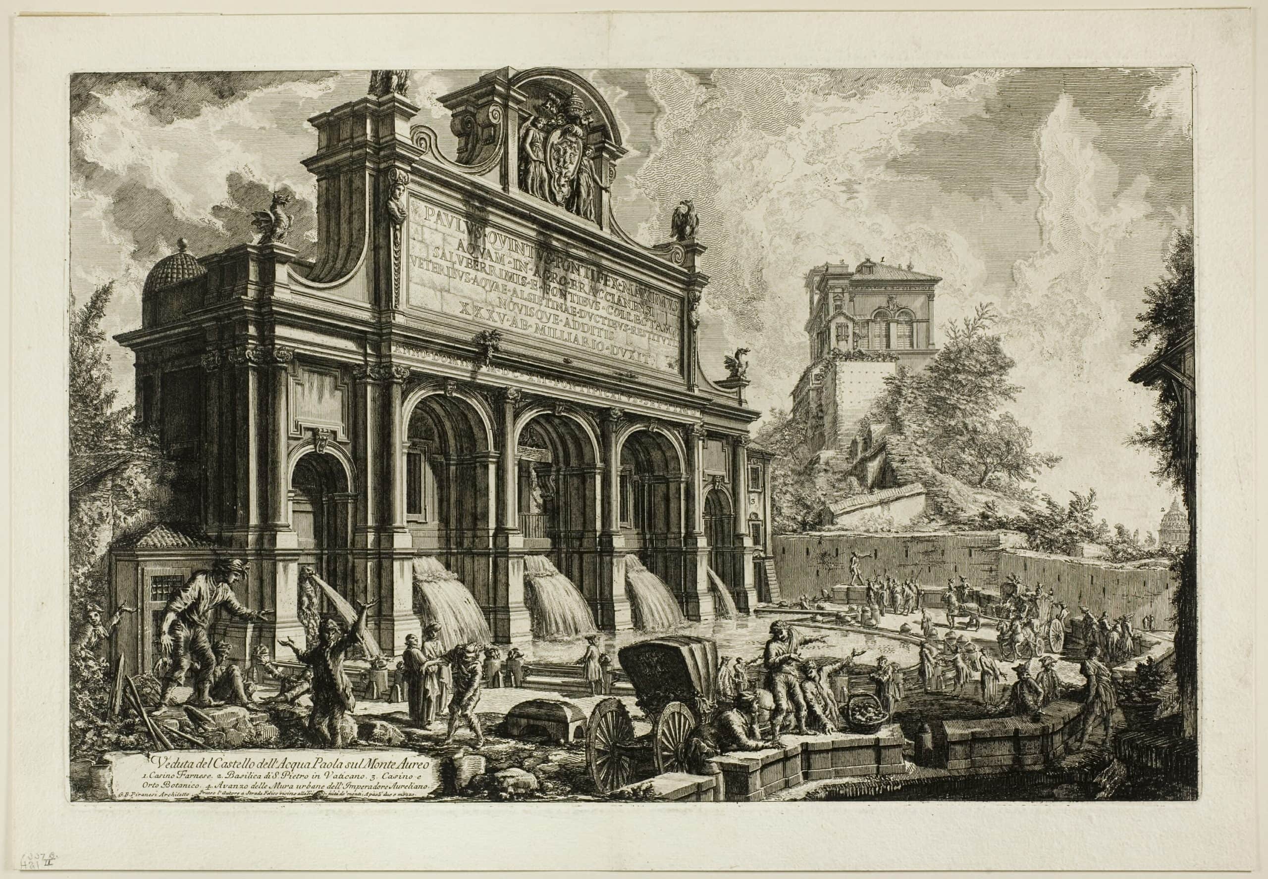

What we can learn from the Italian master Piranesi is that two-point perspectives with multiple facades visible are visually more interesting. Especially if you create visual tension, energy and dynamics in your frame by framing it tightly. Vertical framing elements are important to frame the image.
Pieter Saenredam
Another important visual artist is Dutch painter, Pieter Saenredam (1597-1675), mostly known for his church interiors. What you will see in the following examples is that his compositions are:
- asymmetrical, almost never symmetrical
- 2-point perspectives with multiple planes visible
- full of dimensional depth, he rendered his columns, pillars and arches in such a way that the light-to-dark transitions are amplified to increase the perception of depth. Something that is now commonplace in B&W fine art architectural photography
Avoiding symmetry in series
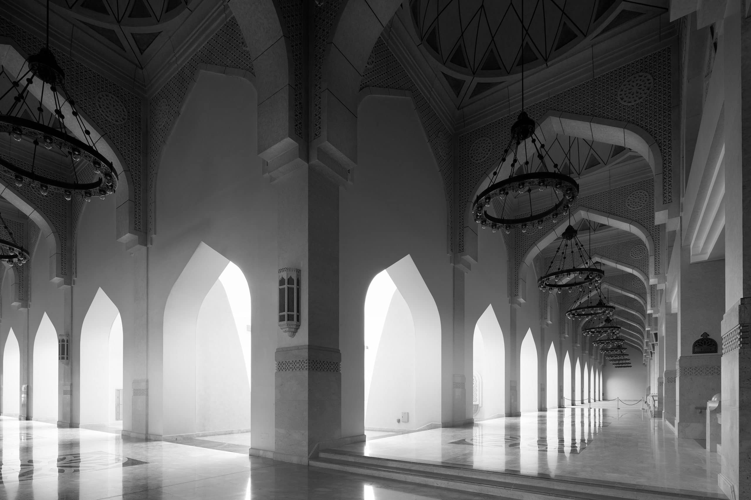
As mentioned in the introduction, a good rule, formulated by Greg Albert is to not let two intervals be the same to create more interest and to avoid symmetry. Obviously, Saenredam used that rule centuries before Greg Albert formulated it. This doesn’t mean that anything symmetrical doesn’t look good. I like to use symmetry myself occasionally but never in a series. When you put architecture interiors side by side as symmetrical compositions in a series, I stop looking at the images in the series after seeing one image only. Because the rest feels and looks the same, they’re instantly recognizable at a glance with my peripheral vision. It doesn’t invite me to explore the series.
On the left, Saenredam’s most famous painting that I’ve seen in the National Gallery in London and I fell in love with it. He didn’t go for the symmetrical composition, but for a far more interesting interior view, emphasizing the big columns and the beautiful rendering of 3-dimensional depth in the columns.
My image on the right, is the gallery in the Grand Mosque in Qatar. Even though one always has a tendency to go symmetrical, especially in interior architecture, I deliberately avoided that.
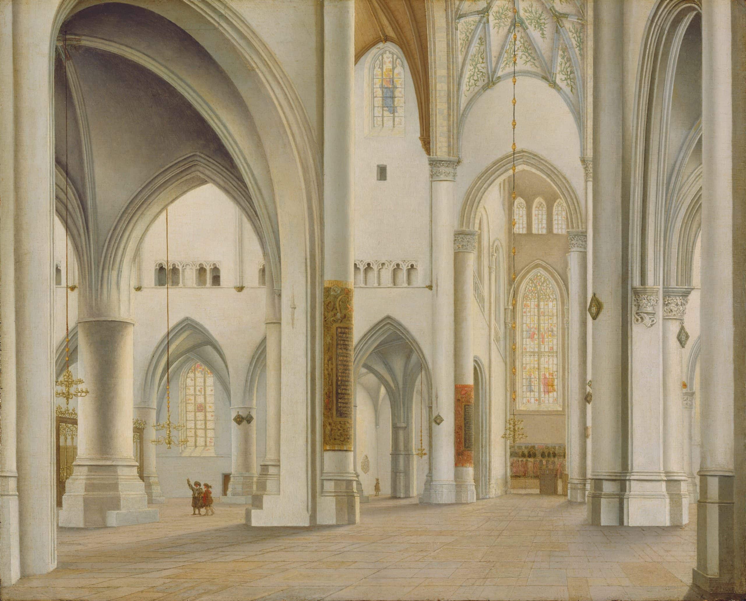
Finally a few other Saenredam images of church interiors. Just notice the asymmetry and the beautiful rendering of depth.
This was the second article on Perspectives on (and in) architectural photography. In conclusion the following compositional considerations are important in architectural photography:
- Negative space is unavoidable but not a serious point of consideration when celebrating the architectural design
- Finding the Maximum Point of perspective is an important aspect to create visual energy and dynamics in architectural photography by distorting and amplifying the perspective on a building in a technically correct way
- 2-point perspectives and finding the angle where 2 facades are visible create more interest and dynamics
- Use vertical framing elements like trees or other buildings
- Don’t be afraid to cut off the top of the building for the sake of visual tension
- Don’t be afraid to frame the object very tightly
- In interiors: asymmetrical compositions create more interest, especially when presented as a series


2 Responses
I really appreciated your article, Joel.
Seeking inspiration from masters like Piranesi and Saenredam is a practice all of us as artists should embrace. Your insights into how their historical perspectives can enrich our contemporary work in architectural photography are very inspiring. Thank you for reminding us of the importance of looking back to move our art forward.
Merci Leo, and very happy to hear that. I think in general too many photographers only look at other photographers for inspiration while visual art in general has a much longer history. And then you can learn things that have worked for centuries but we as photographers have forgotten about. Thanks again!