

Creating Striking But Subtle Dark Images In Black And White Photography
There are many wrong assumptions in black and white photography, when it comes down to tonal zones and what they represent, and how contrasts should be used to reveal details. In this tutorial I’ll try to explain what tonal zones really represent, the role of luminance values within each tonal zone, and how to use this information to create better and more subtle dark images in B&W photography. The image I’m using to demonstrate my point is the Calatrava Bridge photo that won 1st prize for Architecture at the International Photography Awards in 2014 (IPA2014).
Dark Versus Light – Be Subtle
As a photographer of fine art architecture I’ve created many images with dark skies and even darker shadows around buildings. To the unexperienced eye they may look pitch black, but when you look closer and with a more trained eye, you will notice they’re not that dark: I’m just creating the illusion of darkness by playing with contrasts in a subtle way. Many times people have approached me, during workshops, asking me to assess their images with similar visual styling and dark, brooding tones. What I see in practically all cases is that the dark tones are too dark, and the brighter lights, especially in skies are too bright, hence creating an image that is too hard in contrast, where the contrast should be subtle. What do I mean with too dark and too light?Intermezzo: Tonal Zones And Luminance Values In Gray-scale Images
Let’s have a look at the 2 illustrations below that represent the gray scale range.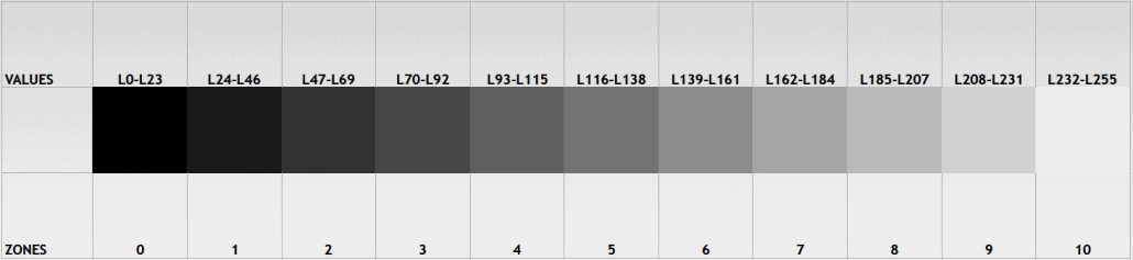
Gray scale range: luminance values and tonal zone distribution
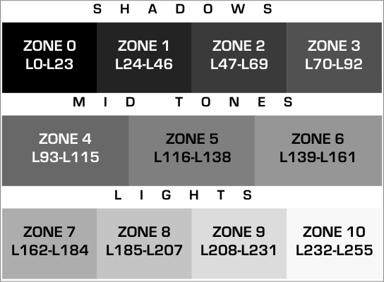
Gray scale range, presented with the commonly used names for ranges of zones
What we can deduce from the illustrations.
- The gray scale consists of 256 values from 0 to 255. Most people call them gray tones but I call them more precisely luminance values. Because that’s what we see in a black and white image: a range of luminance values. Simply light or dark as those tones don’t have a color. Color consists of a hue, a saturation and a luminance value (brightness).
- Ansel Adams taught us that the gray scale can be distributed among 11 zones from zone 0 to zone 10. Meaning all 256 values will find their place in one of those 11 zones.
- The above implies that each zone consists of 23 values, some zones will have 24 values, to make up for an almost evenly distributed 256 values across 11 zones. Which zone that is, doesn’t matter much. I like to put 24 values in zone 0 and in zone 10.
- The commonly used annotation for a gray tone in RGB, is for example (128, 128, 128) which value represents mid-gray as it is exactly half way 0 and 255. If the R(ed), the G(reen) and B(lue) have the exact same value, then it is always a grayscale tone, else it is a color. For example (128, 127, 128) is a subtle color tone, even if there’s only one value difference in the Green value. Since in gray scale tones R, G and B all have the same values, we can also indicate those tones with its luminance value (luminance value = light value = gray tone), in this case of mid-gray it is indicated with L128. This is the annotation I use to indicate gray values.
- When B&W photographers talk about gray tones in relation to zones, it strikes me that they usually talk about it as if there’s no relation between zone and its place in the gray scale range. What I mean with that is the following: zone 0 is very often incorrectly associated with pure black and zone 10 incorrectly with pure white. The point is that zone 0 has 24 values ranging from L0 to L23 and zone 10 also has 24 values from L232 to L255. Now, only L0 is pure black, not the other values within zone 0 like L1, L5 or L20. L20 is much lighter than L2 for example while they’re in the same zone 0. The same goes for zone 10: only L255 is pure white and has no detail, all other values in zone 10 have increasingly more detail the more it approaches L232. Even L253 has more detail than most people think.
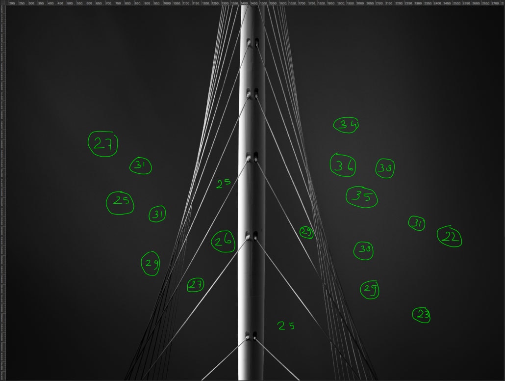
Analyzing The Calatrava Bridge Photo
Now back to the image. I often play with various tones in zone 0 to create very subtle effects since zone 0 isn’t regarded as pure black by me, because that is just a wrong assertion. At the same time, I work with minimal contrast differences to create subtle highlights in the dark sky. Have a look at the Calatrava bridge photo to see what I mean.
Visually, it looks like the areas in RED are pure black and that there are no details visible. While the area in GREEN, seems to be much brighter. Many people would say, the area in RED is zone 0, assuming it is pure black and therefore too dark, and the area in GREEN in the sky is somewhere in the darker mid-tone/ lighter shadow region, such as zone 3 perhaps 4. The visualisation of the streaks of clouds against the dark backdrop seems to be created by a contrast difference of 3 but at least 2 zones.
NOTE: the image seems darker in JPG on the web, but that is not a correct representation of the brightness in the tif file or in the real life image: this image was hanging in various galeries and exhibitions over the world, and people who have seen the photo can confirm it look much brighter than here on this website.

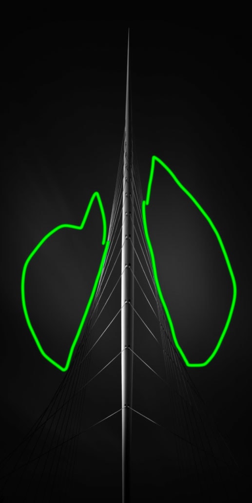
Now, closer inspection – see photo with the distribution of luminance values below – reveals that the darkest value in the RED area is L4, which is in the bridge cables (and therefore not pure black, as stated only L0 is pure black), while the average value in that area in the sky is between L8 and L11. Both values are in the lower region of zone 0 but still visible. You only need a difference of 1 luminance value to reveal some details, even in zone 0! Which is something different than the common assumption that you can’t see details in zone 0. Well, you can, and as a matter of fact, you can see a whole lot of details.
Let’s have a look at the areas in green in the other photo, assumed to be in the darker mid-tone area, visually. Now, I’m not just assuming an assumption by others: I have done various workshops where I discussed this image with in total over a hundred students, and almost without exception students would say the RED area is pitch black, and the GREEN area is somewhere in the mid-tone range, but in any case much brighter. As you can see by looking at the close up image, the darkest value in that brightest area of the sky is L22 / L23 which is still in zone 0! While the brightest value in that ‘brightest’ sky area is L38, but mostly it averages around 30. Well, that is the lower region of zone 1. Zone 1 is considered to be a dark shadow. But this was enough for me to create the illusion of something much brighter than zone 0 / zone 1 and subsequently have a very subtle contrast to make the streaks of clouds in the sky visible.


16 Responses
Absolutely spot on, my friend. I love that you shared this, as it is something that I have been trying to explain to others as well. You have put it into words and explained it perfectly! Now it’s easy… I’ll just link them to this blog.
🙂 Do whatever necessary to make life just a bit easier Kevin! Thanks and have a great weekend!
Black and white Fine Art is like a building: a learned construction. And we are lucky to have a chief architect: Joel Tjintjelaar 😉
🙂 Philippe, sometimes this chief architect wants to jump off this building he created himself:) Many humble thanks!
Very useful information from a great artist =)
Thank you Edwin:)
Very interesting this text Joël. However, it is necessary to have a calibrated and precise screen. I’m not even talking about the constant light environment, or almost. Indeed, with me I hardly see the difference between LO-L23 and L24-L46, then from there to see the subtleties within L0-L23…
Pierre, thank you. And you’re right, you need to have a calibrated screen. But keep in mind that the differences in luminance values in the examples in the article, are clearly visible with the original TIF file. Also, I think that if you cannot see the difference in zones clearly, then you really need to calibrate your screen! 🙂
Nice article. Someday it would be nice to take some lessons from you on black and white. I always get a good base image and then get lost translating my minds vision to print. These simple short articles help.
Thank you Steve – happy to hear those articles help. What I think also help in translating your mind’s vision, is to simplify your workflow. But the downside of that is that you’re going to give up on control. Another thing that might help is to just leave your image for a while and get back to it after a week or more. I often do that and it makes me see things I didn’t see before. I would be happy to give you some lessons!
Joel
Ah, another stepping stone on my route to better black and white photography!
Joel, great post. Your points are well made to help deliver the fantastic images that you envision and produce. You have been a great coach and mentor – all while becoming a good friend! Thanks for your patience and perseverance pass along your experience and advice while keeping a great sense of humor!
I’m flattered Dal but at the same time happy to hear that – And the feelings are mutual! Thank you.
Hi, I found this article while researching for a much more modestly intended BW presentation to my club, and love the clarity of your examples. Having recently (re-)embarked on the prerilous journey of printing from digital, your article made me realise that, in effect, my digital zone 0 (and even parts of zone 1) often, when printed, become compressed into L0; subsequent luminances only start appearing further up the zone scale. Have you written any books or articles that would help me in my attempts to quantify / master this transition?
No I haven’t written anything specifically on that, as printing is another discipline I only know in a superficial way. What I know from printing experts is that often any luminance values lower than L10 will be shown as one value, depending on the Dmax. You can go lower than L10 but it will often result in yellow fringing. If you want to know more than go to RedLab by Red Ognita who’s a printing expert. Here’s his website: http://redlabph.com/
Hi Joel,
This a well explained tutorial. It will help me in my use of Artisan Pro.
Thank you and please keep them coming!
Bob