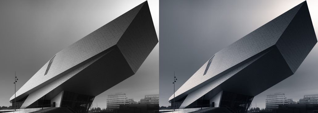
Example Recipe And Visual Workflow
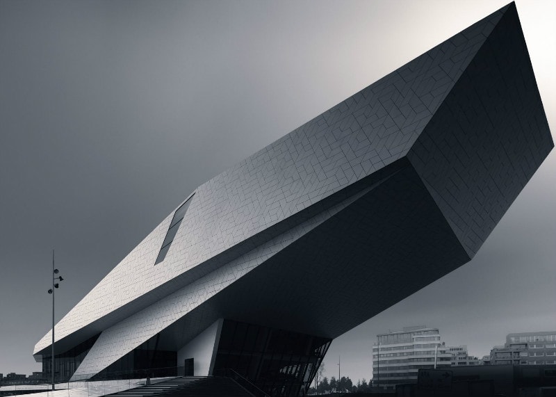
The following recipe is used on my Eye Amsterdam photo and is a similar recipe that I’ve used for the Gotham preset in the Black and White Fine Art Adjustments panel but I’ve made a few minor changes.
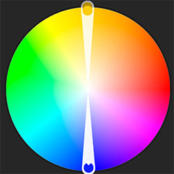
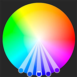
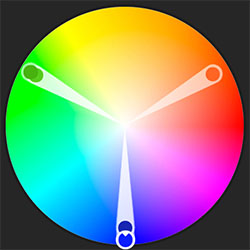
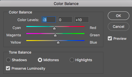
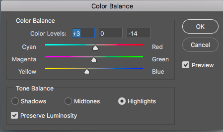
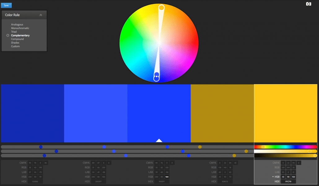
Since I’ve decided to use a blue (cool) hue for the shadows and mid tones with a value of 230 (just slide the slider till you see the color you like and memorize the value) on the color wheel, with a complementary (warm) color for the highlights, I needed to determine the value of this warm color through the Adobe color wheel like this:


17 Responses
Thank you very much Joel for putting all these detailed informations together and for sharing them!
Even though I don’t do black and white, it is still very useful information to understand colors, depth and contrast. The undestanding and control of these parameters help a lot to express the message.
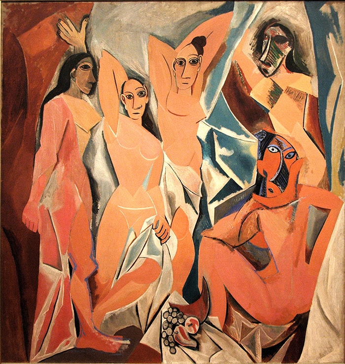
I read that colors also can create depth, warm tones seeming close and cooler tones seeming distant. I personally find it’s true on the Monet painting with the red flowers seeming closer to the blue sky. I guess this is more subjective perception and it is also accentuated by the fact that the flowers are in the foreground…
Thanks for your comment Thibaut, and I’ve also seen an analysis on a Van Gogh painting on how the warm colors seem closer and cool colors more distant, but I think this has to do with subjective perception indeed, not so much with a physical fact. In this context it could be interesting to read Josef Albers’ book “Interaction of Color” considered to be the authoritative work on color. He states for example the following: “In visual perception a color is almost never seen as it really is — as it physically is. This fact makes color the most relative medium in art.”. Anyway, I can recommend reading this book.
– Joel
this is wonderful tutorial Joel, thank you for sharing yout thoughts and techniques.
Thank you!
Thank you Joel for sharing your ‘Pro’ techniques
Glad you liked it Chris.
Thank you for the reply Joel!
This makes sense. Now that I sometimes analyze pictures on the color wheel, I am amazed by the difference between what color I percieve and what the color is really made of. The best example is the green that is often actually yellow 🙂
Thank you for the book recommandation, that is surely a must read. I add it to my list.
If you’re a color photographer then it’s a must read:)
The effect of the colors and your approach of the negative space are really interesting , you are pushing the limits 😉
Thanks Philippe, I’m always trying to push the limits, else how can we ever progress? 🙂
Hi Joel,
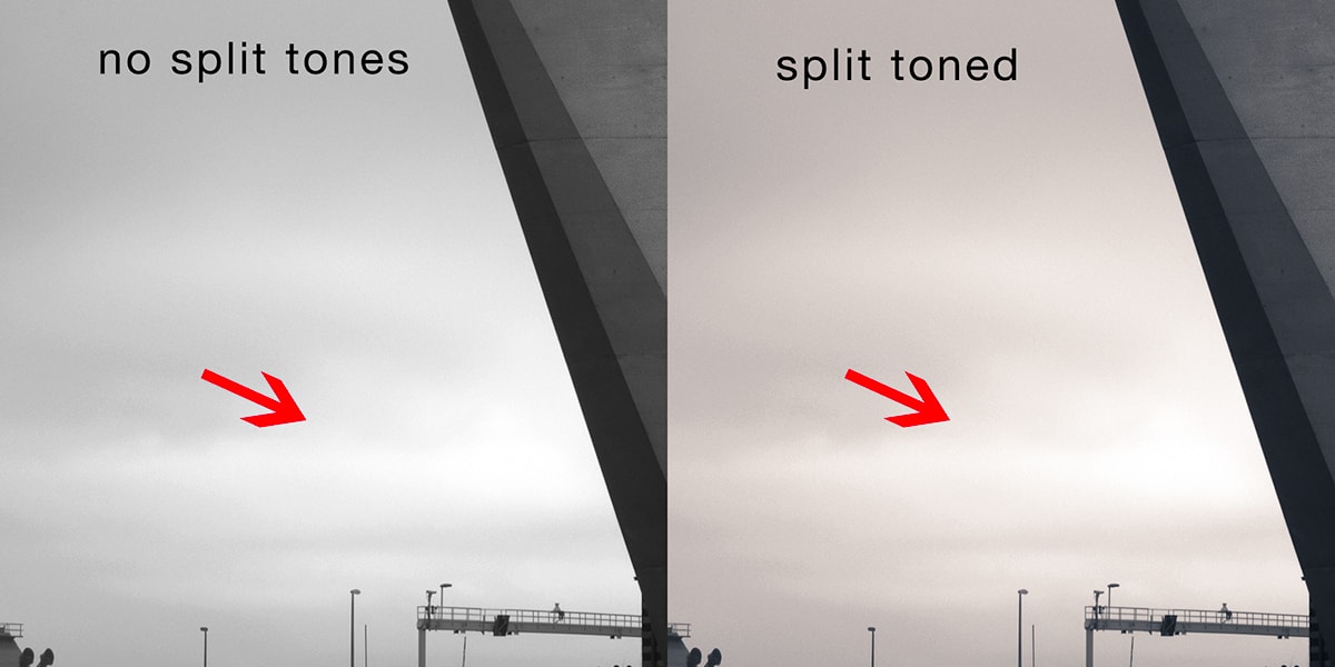
I know it’s quite an old post entry, but I’ve just found it doing some google search on split toning while experimenting Artisan Pro X (great tool by the way).
It seems that you have been experimenting quite a lot with split toning recently. This seems to be a quite a departure from your earlier posts on Piezography for which such split toning is just not possible.
I have a coupe of questions on this:
– have you moved away from Piezography for your more recent prints with such split toning?
– is there anything you can tell us about your experience with split toned B&W printing (presumably on color printers) compared to Piezography?
Thanks
Jerome
Hi Jerome,
Split-toning is something I’ve been experimenting with since a few years, and I do like it in very specific photos. Also, a fast way to make color photos a bit more interesting. As far as I know, split toning is not possible with Piezography, although I’ve heard about something new called Piezography Pro that would allow for control of split tones. I haven’t tried it yet, nor do I know if it works the way I hope it will work with split tones. For now, I’ve only printed my split toned images with color inks and the results are really good, and since the majority of my work is still in pure grayscale tones, I still use Piezography for those prints.
Joel
Joel,
Thanks for your comprehensive answer.
Jerome
Thanks for this interesting tutorial and for all the information that you share in it.
I’m really curiose about the reason to use Mids 1, what I mean, the efect of Mids 1 is overlaping with Darks 3 and Ligths 3 right? it is what you are looking for? The order of the layer has any influence?
Best reggards.