
The Sound and the Shape of Light
The Color Hybrid Workflow: why the best color photograph begins in black and white
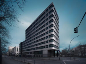
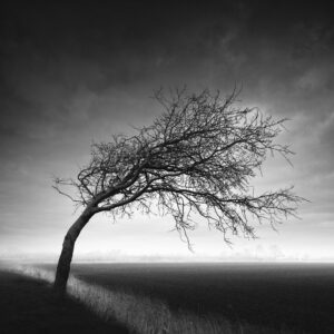
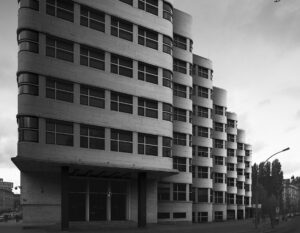
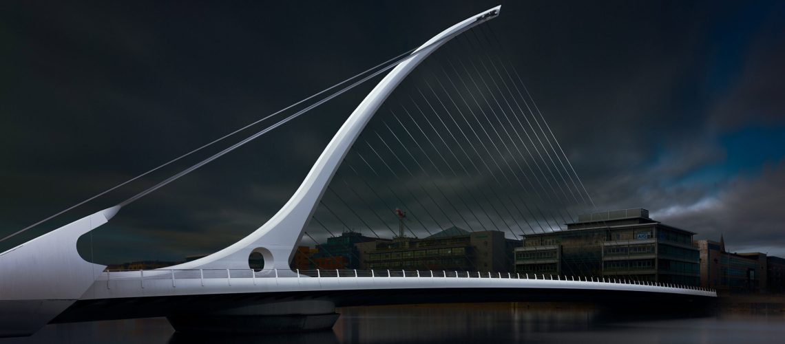
A finished monochrome and a finished color image, from one process — where the color version simply could not exist without the black-and-white one beneath it.
8 minute read
In this article I am positing something that sounds, at first, like a contradiction: one of the best ways to make a good color photograph is through a black-and-white workflow. Not as a detour, but as the foundation. A hybrid process that yields two finished images — a black-and-white photograph and a color photograph — each strong enough to stand on its own in a curated gallery or portfolio.
And this carries a claim worth stating plainly at the outset: the color version produced by this workflow could not exist without the black-and-white one. Its tonal structure has to be established first, and held intact, while color is added on top. Achieving this result technically is nearly impossible when you work in color alone.

1 · The locked baseline — the finished black-and-white

2 · The color, built on it — hue and saturation added without disturbing the tones
The breakdown
My workflow for color photographs has always run in three steps:
- Create the black-and-white photograph first, to establish the correct contrasts and the distribution of light and shadow — in other words, to establish the luminance values.
- Use that black-and-white photograph as the locked baseline for the color version, adding the colors back in without altering those luminance values.
- Refine in color according to established color theory — without ever compromising the locked luminance structure built in black and white.
The idea — lock luminance first, then operate on hue and saturation within that locked structure — is technically sound, and it rests on a real property of how color is constructed. I followed this workflow intuitively for years, long before I suspected there was any deeper relationship between the two systems, and long before I understood that the human eye favors luminance first.
Why it works: light is the shared variable
The reason the method holds together is that light is the shared variable between the two systems — the black-and-white image on one hand, and the color image on the other.
In the HSL/HSB color model, luminance (brightness, or value) is a separable dimension. You can hold luminance constant and rotate hue, or change saturation, independently of it. That is not true of every color model — but it is true of the one that matters for the common digital workflow. This separability is what makes "lock the tones, then paint color onto them" technically possible in the first place.
But there is a deeper reason, and it is not an aesthetic preference — it is a fact of human perception: the eye reads luminance structure first, and color second.
The luminance channel — what vision scientists call the "Where System," the pathway that maps our physical environment — carries the spatial information of a scene: edges, forms, depth, figure/ground separation, and motion. And it is, in effect, colorblind. We perceive depth through the colorblind part of the brain. The Where System is the evolutionarily older and faster of the two. (Margaret Livingstone, Vision and Art: The Biology of Seeing.)
The "What System," evolutionarily newer and slower, is the one dedicated to color, and to the recognition of faces and fine detail. Chrominance carries the mood and the warmth of an image — but at much lower spatial acuity. The visual system devotes far more of its processing to luminance contrast than to color contrast, because the Where System is tuned for rapid reaction — for survival speed.
By establishing the luminance hierarchy first, you build the image on the channel the eye trusts most. Color then becomes the emotional overlay on a structure that is already perceptually sound.
In other words, this method mirrors the way the eye itself constructs an image. That, to me, is the strongest possible justification for the workflow.
A synthesis of two separate systems
The hybrid workflow doesn’t stop there, though — and this is the part that took me longer to see.
The process I just described treats the two systems as sequential and separate: first satisfy the luminance model, then satisfy the color wheel, with luminance locked. This has always worked in practice. But it leaves the two as unrelated systems that seem to have nothing in common — luminance over here, color over there, joined only by the order in which you address them.
There is, however, a unifying idea available. And it is this: the color wheel and the harmonic interval system are the same kind of structure. Both divide a continuous perceptual space into intervals defined by simple ratios.
The unified picture
Seen this way, there are three harmonic systems at work in an image, not two — and they share a common grammar:
Divided by the zone system, structured by harmonic intervals and a 60-30-10 distribution of tonal weight.
Divided by the color wheel, structured by simple angular ratios — complementary at ½ a turn, triadic at ⅓. The same simple-ratio logic. (Newton, Goethe, Albers.)
Behaves like amplitude, or dynamics, in music — how much energy each hue carries — and can itself follow 60-30-10: one dominant saturated region, secondary support, and rare accents of pure saturation.
I wrote about this underlying idea — tone and color and music sharing one structure — in more detail in an earlier article, The Sound and the Shape of Light. This piece is the practical companion to it: the workflow that puts the idea to work on a real image.
See it done on real images
If you want to understand this properly — and to watch the full execution, step by step, on concrete photographs — then I have a webinar and an immersive workshop coming up in the coming months.
Where I go deeper and in practical detail
Workshops and Webinars
Fine art architecture in Paris where the focus will also be on the complete hybrid process, and then there's also a full webinar dedicated to the practical hybrid workflow.
Online webinar — Integrated B&W and Color Processing 17 January 2027.
On location — Paris Fine Art Premium Architecture Workshop 8-11 April 2027
Build the structure in black and white. Let the color be the thing you add — never the thing you hope will hold the picture together.