
How Series · Composition
Why Composition Is the One Rule Architectural Photography Can't Break
A building is not a landscape that happened to have walls — it is an object designed, line by line, to occupy a deliberate place in space. That changes everything about how seriously the frame deserves to be treated.
Spend a few minutes scrolling through fine art architectural photography online and a pattern starts to feel like law: black and white, brooding skies, and a kind of compositional looseness — as if pointing a camera at an impressive building were enough on its own. None of that is actually true. But the assumption that composition barely matters in this genre is the most damaging one, and it gets the whole premise of architectural photography backwards.
A building was deliberately designed to occupy a specific place in space — every proportion, every alignment, every relationship between mass and void was a decision someone made on a drafting table. If that's true, then how you arrange that object within your own frame isn't a secondary concern you can leave to instinct. It's the central act of the photograph. A landscape photographer can wait for better light and let nature rearrange itself. An architectural photographer is composing a response to someone else's composition. That changes everything.
How a Trade Became an Art
It's worth knowing where the "rules" of this genre actually came from, because they didn't arrive arbitrarily. For most of the twentieth century, before air travel and the internet made the world's buildings instantly visible to anyone, photography was the only way most people would ever encounter a piece of architecture they couldn't visit in person. Photographers like Ezra Stoller and Julius Shulman became, in effect, the primary translators between architects and the public — and a close working relationship between architect and photographer, sustained over decades, gave rise to a set of compositional conventions distinct from those in landscape or portrait work, because the subject itself behaved differently. A building doesn't move, doesn't have a mood, and was conceived with geometric intention from the start.
Alongside this came an artistic lineage that predates photography entirely. The eighteenth-century Italian draftsman Giovanni Battista Piranesi essentially wrote the visual grammar that architectural photographers are still using today — asymmetrical framing, deliberate foreground elements, dramatic but technically controlled perspective. The Dutch painter Pieter Saenredam, working a century earlier on church interiors, demonstrated something equally important: that the most compelling interior compositions are almost never the symmetrical ones a casual eye reaches for first.
Out of this lineage, architectural photography became something more than documentation. It became, in its own right, fine art.
Forget the Rule of Thirds
If you've studied photography composition generally, you've absorbed a familiar toolkit: the rule of thirds, the golden ratio, negative space, leading lines. These aren't wrong, exactly. But in architectural work they sit well down the hierarchy of what actually matters — useful refinements, not foundational principles. What replaces them is a grammar of perspective, because perspective is the one variable a building's design doesn't control and your camera position entirely does.
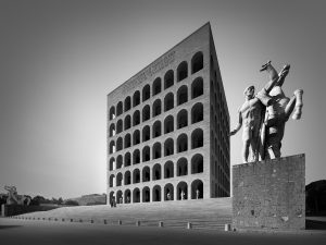
Single-point perspective happens when you face a building's surface dead-on, camera held perfectly level, and the lines that recede into depth all converge toward one vanishing point. Verticals stay vertical. The effect is formal, composed, almost ceremonial — and it's also the single most common shot in the genre, because it's the first thing most people instinctively reach for. That ubiquity is worth knowing: a perfectly centered, perfectly symmetrical building shot is rarely a unique one. Move a few steps left or right, break the symmetry, and the same scene usually becomes more interesting — though some buildings and spaces genuinely call for the formality of dead-center symmetry and shouldn't be forced off-axis just for novelty's sake.
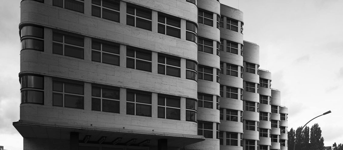
Two-point perspective comes from standing at a building's corner, camera still level, so that two sets of lines recede toward two separate vanishing points, usually well outside the frame. This is the genre's natural hero shot — dynamic, almost theatrical, because you're showing two faces of the structure at once and letting the geometry do the dramatic work.
Three-point perspective adds a vertical convergence — toward the sky or toward the ground — on top of the two horizontal vanishing points. This is rarer and more dramatic still, but it's worth distinguishing between two very different versions of it. The version most beginners discover by accident — tilting the camera up from ground level to fit a tall building in frame — creates a sense that the building is toppling backward, dramatic but not always flattering. There's a more deliberate version: shooting from the top of one tall building down toward shorter ones nearby, keeping the verticals as disciplined as possible while still letting that third vanishing point do its work toward the ground. The difference isn't technical so much as a difference in control — one happens to the photographer, the other is chosen by them.
A Better Vocabulary for Buildings
Here's the limitation of all three terms: they describe convergence and vanishing points, but they don't tell you anything about what actually distinguishes one architectural photograph from another — whether the building's horizontals run parallel to your frame's edges, how many of its faces you can see, whether the composition is symmetrical or deliberately off-balance. Two photographs can both be "two-point perspective" and have almost nothing in common compositionally.
A more useful vocabulary, built specifically for architecture, replaces convergence-counting with a small set of descriptive terms. Axial means the building's horizontal lines run parallel to the horizontal edges of your frame — the structure is "facing" you squarely, even if you're not centered on it. Non-axial means they don't — you're looking at the building from an angle, its lines running diagonally across your frame. Then there's the question of façades: how many sides of the building are visible and contributing to the composition. And finally, symmetrical versus off-center — whether you've placed the building dead in the middle of the frame or deliberately shifted it.
These terms, used in combination, describe almost any architectural composition with more precision than "two-point perspective" ever could. "Non-axial, two façades, off-center" tells you immediately what kind of photograph you're looking at. That precision matters once you're trying to deliberately construct a composition rather than just photographing what's in front of you and hoping it works.
A few patterns worth knowing as starting points, not absolute laws: non-axial compositions tend to read as more dynamic than axial ones, simply because the diagonal lines create more visual tension. If you do choose an axial composition, an asymmetrical version — off-center, perhaps with a second façade just visible at the edge — usually beats a perfectly symmetrical one for the same reason a centered single-point shot often does: symmetry is the safe, expected choice, and the unexpected choice tends to hold attention longer.
The Forgotten Axis, the Z-axis
There's also a technical trap specific to axial shots that catches almost everyone early on: photographers obsess over leveling the horizon, x-axis, and keeping verticals straight, y-axis, and then forget entirely about the third axis, the z-axis — making sure the camera's sensor plane is parallel to the building's own front-facing plane. Get the first two right and skip the third, and the image will still look subtly, naggingly off, in a way that's hard to diagnose unless you know to look for it. Non-axial shots don't have this problem at all — without a flat face-on plane to align with, that third axis simply doesn't apply.
Framing the Building, Not Cropping It Out
One detail separates photographers who treat a building purely as a subject from those who treat the whole scene as a designed image: deliberate use of framing elements. Trees, lampposts, hedges, other buildings, even a darkened bank of clouds along the top edge — these are routinely treated as nuisances to be cloned out by photographers who haven't yet learned to see them as compositional assets instead. Piranesi's etchings are full of exactly this technique: a foreground tree or column doesn't compete with the architecture, it gives the eye somewhere to enter the frame and a sense of scale the building alone wouldn't provide.
This connects to a stronger opinion worth stating plainly: negative space, in the sense it's used in minimalist photography — generous empty areas left deliberately unfilled to create a feeling of calm or isolation — works against the purpose of architectural photography rather than for it. Architectural photography exists to celebrate a designed object; treating that object as one small element floating in a sea of negative space undercuts the entire reason for taking the picture. The alternative is what's worth calling functional space — the space genuinely required by the structure itself to register clearly as the unambiguous subject, no more and no less. None of this means negative space is forbidden. It means understanding that the more of it you add, the more visual weight transfers away from the architecture and onto the emptiness around it.
The Razorblade and Beyond
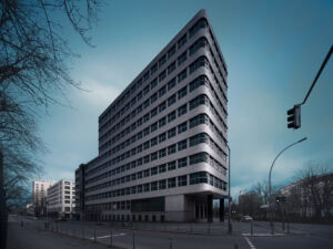
Some of the more striking compositions in this genre come from deliberately forcing a single façade into a non-axial, angled frame — shooting the building from a corner-on position but cropping so only one face is fully visible, its edge slicing diagonally across the frame. This works especially well on buildings with a naturally tapering, near-triangular footprint — the Flatiron Building in New York is the textbook example — where the technique emphasizes the building's flatness and gives it a sense of motion, almost like a blade cutting through the air. It's an aggressive, attention-grabbing composition, and like most aggressive choices, it's better suited to fine art work made on your own terms than to commercial assignments where a client has their own expectations for how their building should be presented.
Beyond single-façade compositions, axial and non-axial elements can also be deliberately combined within a single frame — one façade running parallel to your frame's edge while another recedes diagonally away from it, in varying degrees of balance. There's no fixed formula for which balance works best; it depends entirely on what the specific building and its surroundings offer, and on what feeling you're trying to create.
Getting Close: The Maximum Point of Perspective
There's one further technique worth knowing, because it's less a rule than a way of thinking about how far you're willing to push a composition before it stops looking like documentation and starts looking like something closer to abstraction.
Call it the maximum point of perspective: the practice of getting as physically close as possible to a building — typically using a wide-angle or tilt-shift lens — to push perspective distortion right up to its limit while keeping every line technically correct. No bent verticals, no warped geometry; just an angle of view so extreme it exceeds what the human eye can take in in a single glance. Step back a few meters and the same building looks calmer, more "normal." Get as close as the lens allows and the same structure becomes dramatic, looming, almost confrontational.
This isn't free. Getting that close usually means sacrificing breathing room around the building — a real trade-off between maximum perspective drama and giving the structure space to exist comfortably within the frame. Which side of that trade-off you land on is a genuinely personal, artistic choice rather than a technical one. There's also a more extreme version worth knowing: pushing in even closer than the maximum perspective point, intentionally cropping off an edge or the top of the building entirely, so the image reads simultaneously as a detail shot and a distorted, dramatic perspective — the cut-off edge functioning almost as a visual cue that tells the viewer's eye it's looking at something deliberately exaggerated rather than simply badly framed.
When the Building Has No Outside
Everything so far has assumed you're standing outside a building, choosing an angle on its exterior mass. Step inside, and the same principles apply but the problems multiply, because interiors are rarely as cooperative as façades.
Outdoors, a building usually offers a small number of clean, legible faces to work with. Indoors, you're often surrounded by columns, stairwells, furniture, and ceiling structures all pointing in different directions at once, with no single dominant line to organize the frame around. The eye needs something to hold onto, and that's where axial grounding becomes useful even inside spaces that aren't fully axial themselves: including at least one strong horizontal or vertical reference — a floor line, a row of columns, a ceiling beam — gives the viewer's eye a place to stabilize before it starts exploring the rest of the chaos.
Circular and curvilinear interiors complicate this further, since there's no true horizontal to anchor to. There, the closest equivalent is an imaginary horizontal — the line that would exist if the curved space were unrolled flat — orienting the composition around that implied structure rather than a literal one.
The instinct toward symmetry shows up indoors even more strongly than outdoors, for an understandable reason — disorienting spaces make people reach for the most stable, legible composition available, and a perfectly centered shot down the middle of a nave or hallway is the most stable option there is. That instinct isn't wrong, exactly. A symmetrical interior shot can absolutely work, especially as one image within a broader series otherwise built on asymmetry. But it's worth recognizing the instinct for what it is — a reach for safety in an unfamiliar visual environment — rather than assuming it's automatically the strongest choice available.
Building Your Own Compositional Language
One last thing worth saying about all this vocabulary — axial, non-axial, façade count, the razorblade, the maximum point of perspective — is that none of it is meant to function as a checklist to run through on location. Naming a thing clearly is what makes it possible to choose it deliberately instead of stumbling into it by accident. A photographer who only knows "two-point perspective" can describe what a lens did. A photographer who knows the difference between an axial off-center shot with a single forced façade and a non-axial composition combined with a deliberate maximum point of perspective can describe what they intended — and intention is the difference between a photograph that happens to be interesting and one that's interesting on purpose.
It's also worth saying plainly: these aren't universal laws handed down from above, they're a working vocabulary, refined over years of standing in front of buildings and noticing what kept working and what didn't. Other photographers will draw their own conclusions, develop their own preferences, maybe even arrive at compositions this framework doesn't have a name for yet. That's exactly as it should be. The point was never to replace instinct with rules — it was to give that instinct something precise enough to argue with, so that every choice in front of a building is one you can actually defend, rather than one you can only shrug at.
What's here is the short version and the 4th preview from the series of summarized previews of chapters of the forthcoming book. The book will go further — walking through the axial framework in full, and breaking down exactly how the Razorblade Perspective and the Maximum Point of Perspective are built, frame by frame.
If you'd rather learn these techniques on location rather than on the page, that's exactly what the Netherlands–Belgium Fine Art Architecture Premium Workshop is for. Over four days in Amsterdam, Rotterdam, and Antwerp (November 5–8, 2026), you'll apply MPoP and the Razorblade Perspective to real buildings, with direct, in-person guidance.