

This is not a theoretical article about what fine-art photography is, I’ve talked about that in various articles on this website. Most photographers agree that fine-art photography should be meaningful. To me, meaningful means that it prompts awareness of something we weren’t aware of before. Because ‘good’ fine-art photography is about the individual perception of an experience transformed to fine-art and has the power to be perceived by the observer as that same or similar experience.
But fine-art also has a very important visual and aesthetic element. Without a strong visual trigger, the meaning of a photograph wouldn’t be effectively conveyed.
This article describes and suggests a practical step-by-step method for fine-art processing, purely seen from an artistic and aesthetic point of view without going into the technical aspects of Photoshop at all, as I firmly believe Photoshop skills shouldn’t be decisive. And I will try to demonstrate that you can actually do with almost no Photoshop knowledge at all to create high-end gallery worthy and award-winning prints.
All you need is an artistic spirit, even though there are few other elements that are also of great importance during the shooting phase and are of a technical/mechanical nature. But I doubt you’d be reading this without any basic camera knowledge.
Strong shapes and contrast edges
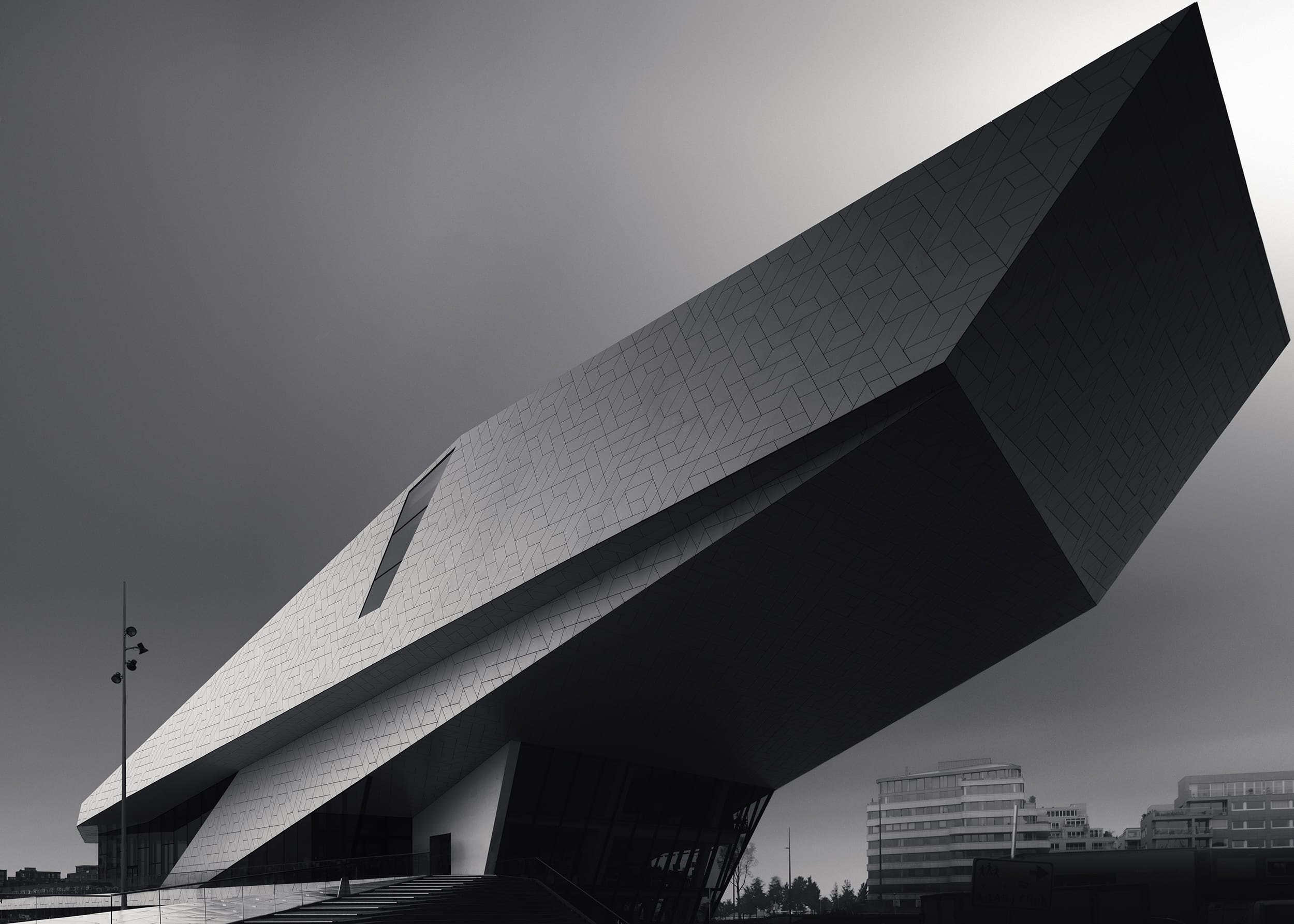
When it comes to strong photographs then we have to give importance to depicting strong shapes. Some of the greatest photographers in history have taught us that. Just have a look at some of Irving Penn’s portraits and what he said about those: it’s all about the shape when we consider the pure visual elements of a photograph.
A photo without a strong shape is like an orator with an insecure squeaky voice. Imagine Martin Luther King’s famous speeches orated without conviction and without power. The volume, pace, timbre, and intonation of the voice in speech are the shapes and lines in a photograph.
Strong shapes are essential. And shapes are defined by contrast edges. We see shapes and recognize instantly what that shape represents, without even looking at the details. Neuroscientist and author of the book ‘Vision and Art – The Biology of Seeing’ Margaret Livingstone already stated that we recognize shapes through our peripheral vision that is focused on detecting contrast edges, not on details.
Contrast edges define shapes. The stronger contrast in the edges the more clearly and instantly a shape is recognizable.
Furthermore, we also know that when looking at an image our eyes are always drawn to the areas in the image with the highest contrasts and brightest lights. Hence, if we have a strong shape, clearly visible and defined by its strong contrast edges and the contrast edges are the highest contrast areas in an image, we know that the viewer will instantly see it and will be drawn to it. If your shape is the most important object in your image and has sufficient contrast edges but not the highest contrast area, then you’re losing the viewer’s attention.
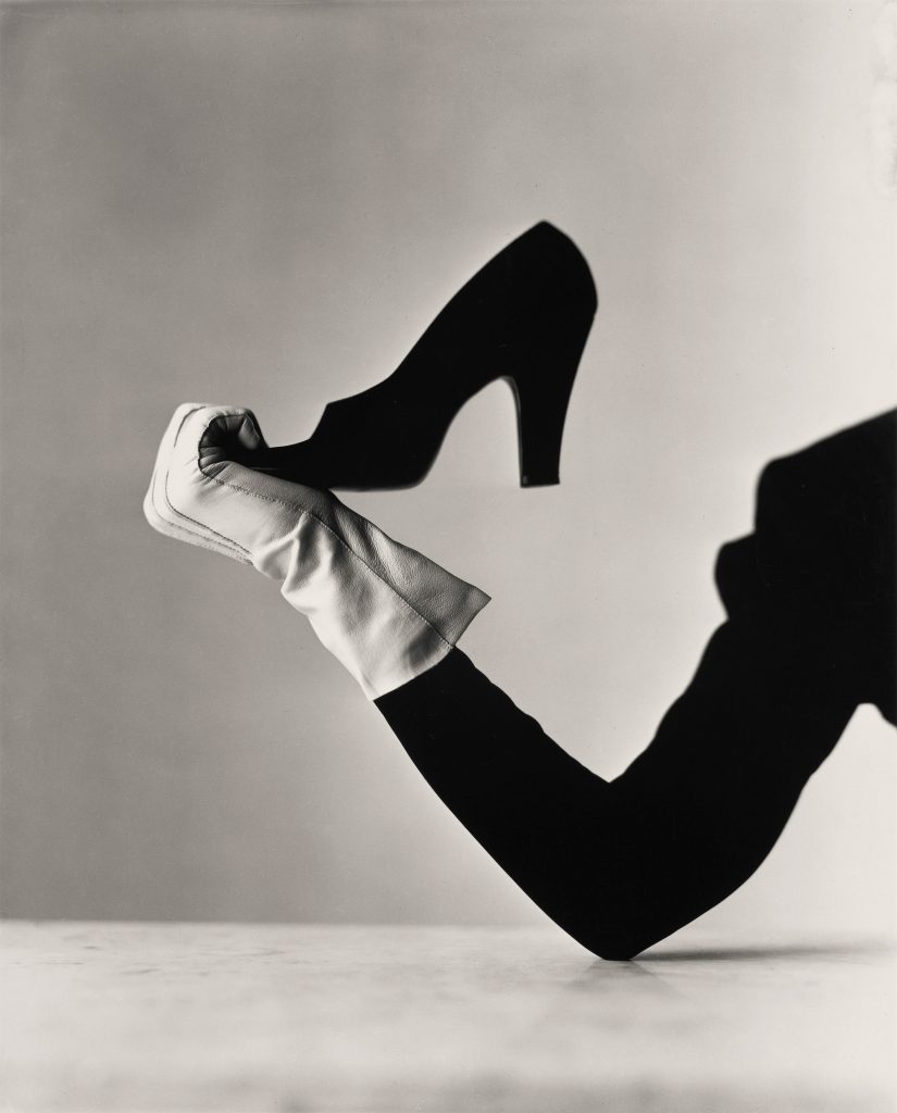
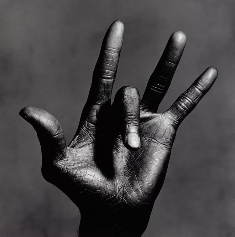
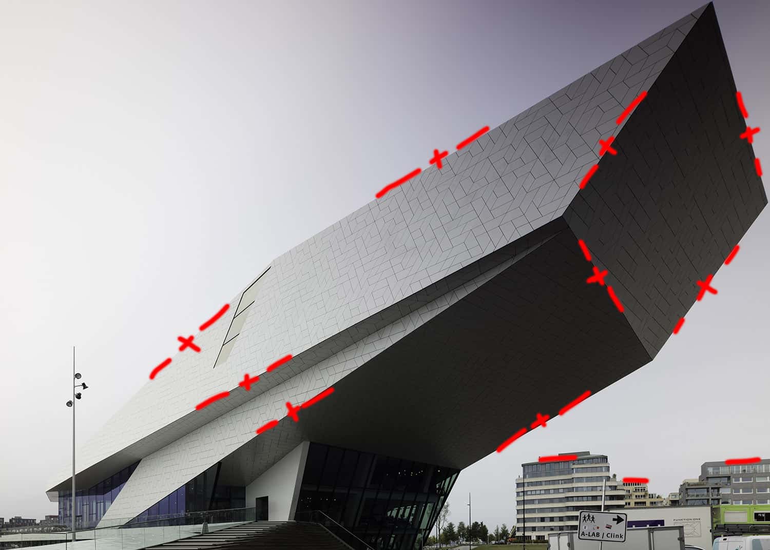
Figure and Ground relationship
Mark Getlein called this shape, that represents the most important object, the focused object, in the photograph, the Figure. Everything else is just Ground. Background, foreground, middle ground, anything, is just Ground and has no visual importance. The Figure and Ground relationship is the most important relationship in a photograph.
This is what Mark Getlein says in his book “Living With Art”
We perceive shapes by mentally detaching them from their surroundings and recognizing them as distinct and coherent. We refer to this relationship as figure and ground. A figure is the shape we detach and focus on; the ground is the surrounding visual information the figure stands out from, the background.
Mark Getlein
So it’s about shapes that:
- we should mentally, but also literally, be able to detach from its surrounding Ground.
- have contrast edges, so we can perceive them as strong shapes that stand out clearly from its surrounding area.
- when they are the most important shape, and the shape we visually detach and focus on, is called Figure
- when they are the Figure, should have the highest contrast edges.
Depth perception
At some point, we arrive in-camera or after post-processing at a Figure that is enhanced to have contrast edges but has a limited amount of perceived depth. The depth we perceive in an image is not just a matter of perspective lines. A sphere that only has contrast edges but has no proper shadow to light TRANSITION, will look like a 2-dimensional circle. A road that’s vanishing into the horizon will look like a flat triangle if it has no correct shadow to light transition. Correct and consistent shadow to light transitions and vice versa are fundamental for a correct and impressionable perception of depth. You can leave out perspective lines and still have a tremendous amount of depth perception in an image, but you can’t leave out shadow to light transitions and only leave correct perspective lines to create the illusion of depth.
Also important for a correct perception of depth is the increasing contrast (and hence details) for objects that are closest to the observer and decreasing contrast for objects farthest away from the observer.
The ingredients for a strong image
So there we have all the necessary visual ingredients for a good image:
- Figure
- Contrast
- Depth
What about color? Surely colors create mood, but never depth – depth is a purely monochromatic affair of dark to light and vice versa as depth perception only takes place in the colorblind part of our brain. Colors don’t define shapes either, contrast edges do. Colors are symbolic. And I do love colors, and if applied correctly and with thought, can add mood to a photograph and emphasize shapes and planes, even create perceived movement. But that’s another topic I’ve already briefly touched on in some of my articles.
A Practical Example and Schematic Overview
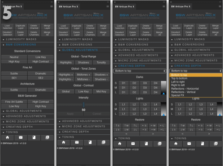
So how does this information translates to an actual image and how can I do that? For that purpose, I created a schematic overview and the Youtube video tutorial below in which I explain step by step what to do with a Figure, once you’ve decided what your Figure is, first during the shoot, and then in post-processing. Then what to do with contrast edges and how they translate to selections that need to be created and finally how to create depth in an image. You can do everything manually if you’re an experienced PS user, or you can use my new B&W Artisan Pro X panel that will do everything for you, except for the creation of selections. I can promise it is easier than you think to create strong images where strong shapes and depth play a prominent role if you have just a hint of artistic vision. And even easier and more efficient if you decide to buy the panel as it is designed around the principles of Figure-Contrast-Depth.

As this processing method of figure-contrast-depth in this form is my intellectual property, you can only use this for your own personal use, unless you refer to this article and author.
Full Video Tutorial Figure-Contrast-Depth using B&W Artisan Pro X panel (but any other manual method can be used to apply the principles)
More Info
- My article on fine-art photography on this website.
- In defense of Black and White photography on this website.
- More on B&W photography, and fine-art photography in the highly praised eBook From Basics to Fine-art, that I co-wrote with fine-art photographer and architect Julia Anna Gospodarou
2 Responses
As a user of your panels I found your video (tutorial #3), as I watched it on YouTube twice yesterday, somewhat intimidating, not in how you showed your approach or used the panel, but in how you worded your explanations in the tutorial. Having said that I can’t but be very appreciative of your article here in how well written and thorough it is. Great work and very good as a welcome companion to the video.
Thanks Wouter – not sure why you think it’s intimidating but of course other people see (or hear) things I don’t see as I’m not very objective in how my explanations are perceived. I can assure you though that I don’t mean to be intimidating at all! Thanks again.