

Introduction
Since I wrote about High Level Principles For Fine Art Processing a few years ago in a blogpost on this website, based on the 9-hr video The Artistic Thought and Decision Process, this workflow has seen a few additional steps and refinements to make it faster and more accurate to cover all genres in photography: from architecture to landscape and portraiture. Most important reason for this were the recent commissioned projects that required me to finish almost 60 images in fine art style in roughly a year, without loss of quality.
I needed to simplify and speed up my workflow that would often take me weeks to finalize one image. So here I’m presenting the revised workflow as a JPG that you can download with a brief explanation.
Video explanation is essential
Of course, a comprehensible explanation on the additional steps and refinements to the existing workflow, can only be given visually in a video. For this I’ve created the following free YouTube video that demonstrates the revised workflow posted a year ago, using the Artisan Pro panel. But it needs to be clear that this workflow can be done with basic PS features as well. Also, I created a new short YouTube video where I apply the same principles to portraiture photography. See further below.
A good B&W Fine Art workflow (and the Artisan Pro plugin) can be used for any genre in photography. All the principles and techniques are the same.
Joel Tjintjelaar
New Video: B&W Portraiture Processing
Together with this new blog post, there’s also a new shorter from-start-to-end YouTube video where I apply the workflow, that I always use for architecture and landscapes, on portraiture – see video below – to demonstrate that a good B&W Fine Art workflow (and the Artisan Pro plugin) can be used on any genre in photography. All the principles and techniques are the same.
Creating Depth more accurately and easier
The most important change is that the creation of depth is now a combination of luminosity masks and the gradient tool. The appearance of depth is the result of a gradual light-to-dark or dark-to-light transition on a specific plane, usually created with the gradient tool.
The gradient tool has always been the most obvious tool for this purpose if it were to be applied to a flat straightforward plane like a sky or the side of a building.
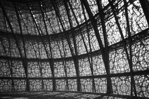
But how to create depth on amorphous more intricate shapes, on the human body or, like in the example of the video on more convex/concave shapes where, due to the position of the planes, there are multiple light sources? It is not easy and very time consuming to get it right with just the gradient tool.
The trick then is to additionally create luminosity masks and evaluate them and to identify the following:
- A narrow range light luminosity mask for (specular) highlights
- A wider range light luminosity mask to lighten more globally and to connect dark with light
- A narrow range dark luminosity mask for only small darker details
- A wider range dark luminosity mask to darken more globally and to connect dark with light
The light to dark transition is then established by applying the wider range light, followed by the wider range dark luminosity masks, and lightening and darkening respectively, and emphasize the transition with either one of the wide range masks depending if it needs to be darker or lighter.
Watching the video to understand how this works makes more sense than trying to describe this.
The JPG image below and the description is there for your convenience to understand the context of the process this method is a part of. If you don’t want to use the panel and you’re proficient enough with Adobe PS then you can do this with Adobe PS basic features as well. The suggested PS adjustments are in a separate column in the table. But it’s more time consuming and less consistent.
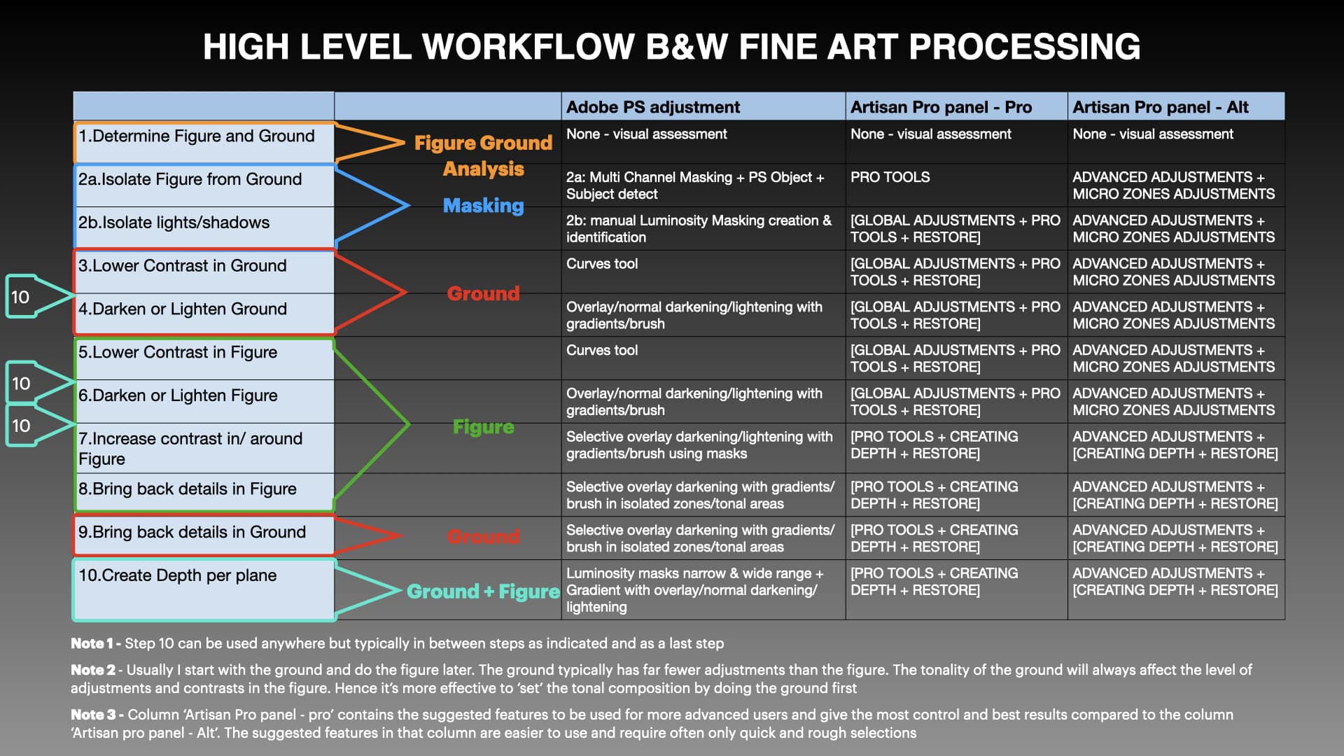
Click and open in new tab to download – (c) Copyright Joel Tjintjelaar 2023
Workflow steps explanatory notes
- Determine figure(s) and ground(s). More info here
- Create Hard masks and Luminosity (soft) masks (watch video to understand this better):
- Isolate Figure from Ground by creating hard masks – the critical masks. You can skip this step but then you have less control over the contrast, the light intensity, and the depth perception in both figure and ground. `especially in case of geometric shapes: break down the Figure into separate planes with derived masks.
- Isolate Light and Shadows by creating luminosity masks for creating depth (narrow and wide range luminosity masks) and bringing back the details. These are needed for steps 8, 9 and 10.
- Lower contrast in Ground. Then darken if your Ground should be darker and low-key or lighten if it should be lighter and high-key. But lowering the contrast first is essential before darkening or lightening, else you end up with higher contrast in the ground no matter if it’s lightened or darkened. It is possible to start with the Figure first, but I recommend doing the Ground first for correct perception and minimize corrections.
- Darken or lighten the ground globally.
- Lower contrast in Figure selectively. Same principle as in lowering the contrast in Ground. The idea is that by lowering the contrast first, it is easier to see what needs to be lighter/darker/less or more contrasty. Also, it will be easier to control the tonality and contrasts.
- Darken or lighten Figure globally depending on how the light should fall. Essentially the same as in step 3 for the Ground but now more selectively
- Increase contrast in and around the Figure
- Bring back details in Figure selectively – often using hard masks with intersected luminosity masks in isolated areas.
- Bring back some details in the Ground selectively and more subtly than the details in the Figure. The goal is to add points of interest to accentuate a leading line for example. Or to enhance mood by accentuating clouds. Always keep in mind that it should be secondary to the figure in terms of contrast and light intensity. Use of luminosity masks with intersected hard masks in isolated areas.
- Create depth per plane using subtle gradual transitions from dark to light and vice versa per plane in Figure and in Ground. For shapes/planes that are not flat and straightforward, use the narrow range/wide range luminosity masks intersected with hard masks. Finish it off with restore steps if necessary. This step is numbered 10 but can be inserted after every step after step 2. Which is how I usually use this.
Relevant in-depth resources
The high level workflow in this article is based on, and is an addition to, The Artistic Thought and Decision Process video: A 9-hour video tutorial that goes in-depth and in detail on the most important aspects of B&W fine art processing. Key principles and background information, the Why and How, for the high level workflow in this blog post will be explained in detail in the video with many examples except, obviously, for the part in this post where I describe the additional modified part of creating depth using luminosity masks. For example, the reasoning why I would remove contrast on a plane first before I start processing it, and where and how to create depth will be elaborated upon in this video.
2 Responses
Once again, Joel shows us how to achieve world-class post-processing that is so comprehensively complete that you don’t need anything else. The continued evolution of his methods are highly coveted by the few, the savvy, and the successful photo-artists among us.
Haven’t had time to review this yet only because I know once I start I won’t want to stop. You continue to improve your techniques and share them so willingly! I wish you continued success.